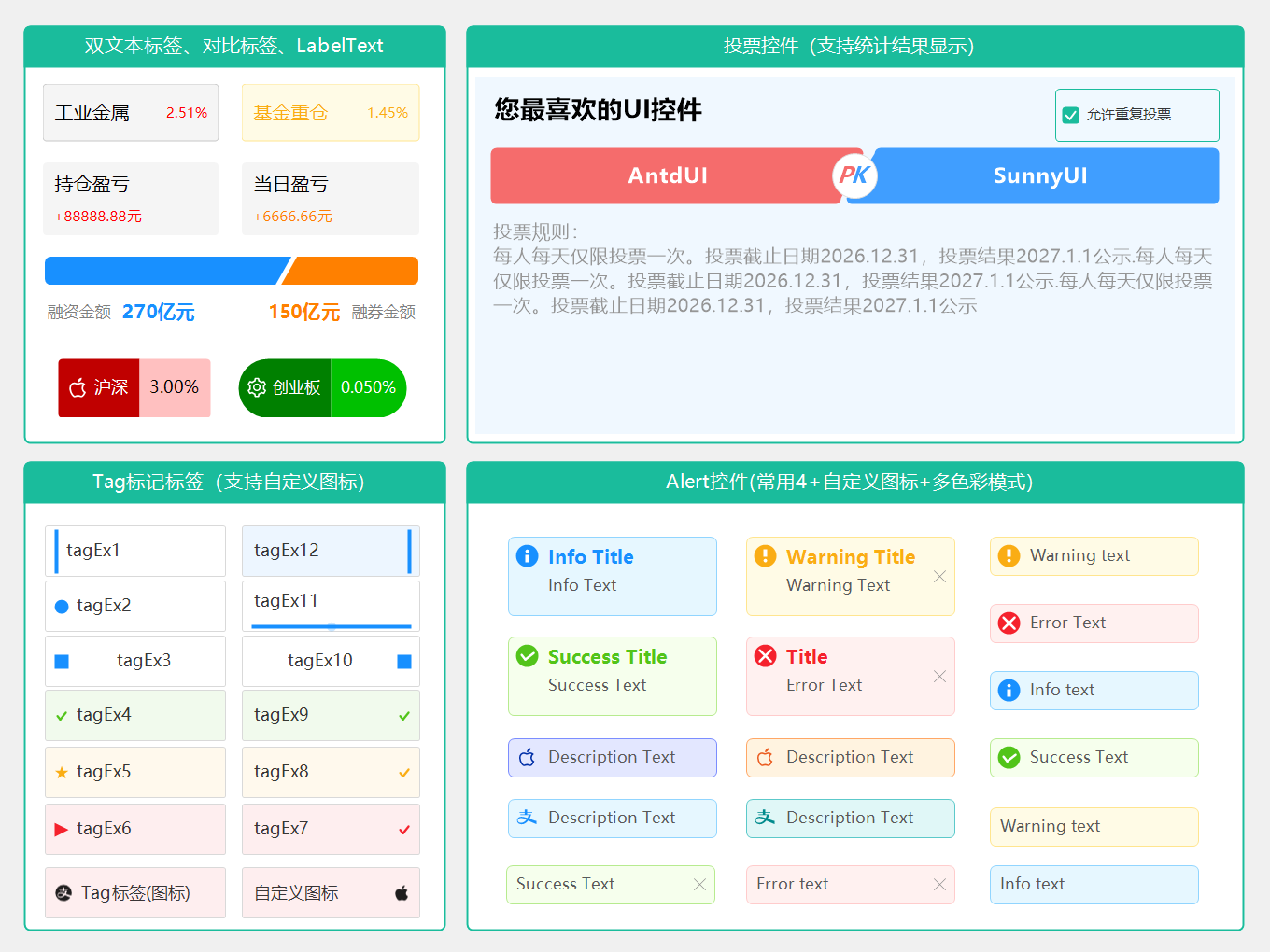
- VoteControl 是一个美观的投票控件,采用现代化设计风格,支持两个选项的 PK 投票场景。
- SideBySideLabel 是一个并排标签控件,支持左右两部分对比显示,带斜切口横向柱状图。适用于数据对比、统计展示等场景。
- LabeledValue 是一个标签值控件,支持主标题和副标题显示、预置颜色样式和圆角边框。适用于标签展示、状态显示等场景。同页展示:Tag,Alert控件
一、 示例
二、使用说明
2.1 VoteControl 投票控件
控件名称
VoteControl
中文名称
投票控件
控件优点
VoteControl 是一个美观的投票控件,采用现代化设计风格,支持两个选项的 PK 投票场景。
主要特性
- 现代化设计:红色和蓝色按钮配合斜切间隙,中间带有 PK 标识
- 防重复投票:已投票后自动锁定,防止重复投票(可通过属性关闭)
- 重复投票支持:设置
AllowReVote = true 可允许用户多次投票
- 实时反馈:悬停效果、选中状态、投票次数显示
- 精确点击区域:仅在按钮区域内响应点击,标题和描述区不触发
- 完整功能:支持投票标题、描述(支持换行)、选项文本、投票统计
- 事件驱动:投票完成后触发 VoteClick 事件,包含最新计数值
重要参数说明
公共属性
| 属性名 |
类型 |
默认值 |
说明 |
Title |
string |
"投票标题" |
投票标题 |
Description |
string |
"投票描述" |
投票描述(底部显示,支持 \n 换行) |
OptionAText |
string |
"选项A" |
左侧红色按钮文本 |
OptionBText |
string |
"选项B" |
右侧蓝色按钮文本 |
OptionACount |
int |
0 |
选项A投票次数 |
OptionBCount |
int |
0 |
选项B投票次数 |
HasVoted |
bool |
false |
是否已投票(防止重复) |
UserVote |
VoteResult? |
null |
用户投票结果 |
AllowReVote |
bool |
false |
是否允许重复投票 |
枚举
public enum VoteResult
{
    OptionA,  // 投票给选项A(左侧红色)
    OptionB   // 投票给选项B(右侧蓝色)
}
事件
| 事件名 |
说明 |
VoteClick |
默认事件,点击按钮时触发,参数为 VoteClickEventArgs |
Voted |
成功投票后触发,参数为 VoteResult |
VoteClickEventArgs 参数
| 属性名 |
类型 |
说明 |
VoteResult |
VoteResult |
用户点击的选项 |
CanVote |
bool |
当前是否可以投票(考虑 AllowReVote) |
CurrentOptionACount |
int |
投票后选项A的最新计数值 |
CurrentOptionBCount |
int |
投票后选项B的最新计数值 |
使用示例
基本用法
var voteControl = new VoteControl
{
    Title = "螺丝选国标还是国际标准?",
    Description = "投票规则:\n每人每天仅限投票一次",
    OptionAText = "选国标",
    OptionBText = "选国际",
    Location = new Point(50, 50),
    Size = new Size(400, 180)
};

// 订阅投票事件(双击控件自动生成)
voteControl.VoteClick += (sender, e) =>
{
    if (e.VoteResult == VoteControl.VoteResult.OptionA)
        MessageBox.Show($"您选择了国标!当前 {e.CurrentOptionACount} 票");
    else
        MessageBox.Show($"您选择了国际标准!当前 {e.CurrentOptionBCount} 票");
};

this.Controls.Add(voteControl);
允许重复投票
var voteControl = new VoteControl
{
    Title = "实时人气投票",
    OptionAText = "AntdUI",
    OptionBText = "SunnyUI",
    AllowReVote = true  // 允许重复投票
};

voteControl.VoteClick += (sender, e) =>
{
    // 每次点击都计数+1
    labelResult.Text = $"AntdUI: {e.CurrentOptionACount} 票 vs SunnyUI: {e.CurrentOptionBCount} 票";
};
加载已有投票数据
var voteControl = new VoteControl
{
    Title = "最喜欢的编程语言",
    OptionAText = "C#",
    OptionBText = "Python",
    OptionACount = 156,
    OptionBCount = 142,
    HasVoted = true,
    UserVote = VoteControl.VoteResult.OptionA
};
重置投票状态
// 允许用户重新投票(清除已投票状态,但不重置计数)
voteControl.ResetVote();
手动投票
// 编程方式进行投票
voteControl.Vote(VoteControl.VoteResult.OptionB);
外观说明
布局结构
┌─────────────────────────────────────────────┐
│  投票标题                                    │
│                                             │
│  ┌──────────────────┬──────────────────┐   │
│  │   选项A          │   选项B          │   │
│  │   (红色梯形)     │   (蓝色梯形)     │   │
│  │                  │                  │   │
│  └──────────┬───────┴───────┬──────────┘   │
│             │      PK       │              │
│             │  (白底彩字)  │              │
│  投票描述(支持换行)                         │
└─────────────────────────────────────────────┘
按钮样式
| 状态 |
说明 |
| 默认 |
红色(左侧)/ 蓝色(右侧)按钮,直角梯形设计 |
| 悬停 |
按钮颜色变亮,鼠标变为手型(仅未投票时) |
| 选中 |
投票后显示白色边框标记 |
按钮形状
- 左侧红色按钮:倒直角梯形,左边垂直,右边斜切,四角圆角
- 右侧蓝色按钮:正直角梯形,右边垂直,左边斜切,四角圆角
- 间隙:两个按钮之间留有间隙,中间放置 PK 图标
PK 图标
- 白色圆形背景,大小为按钮高度的 2/3
- P 字母:红色,向右倾斜(与按钮斜切角度一致)
- K 字母:蓝色,向左倾斜(与按钮斜切角度一致)
- 采用斜体字体,两字母紧凑排列
鼠标光标
| 区域 |
光标样式 |
| 按钮区域 |
手型(Hand) |
| 标题/描述/空白区域 |
默认箭头(Default) |
注意事项
- 防重复投票:默认
HasVoted = true 后点击按钮不会触发投票;设置 AllowReVote = true 可解除限制
- 投票次数:
OptionACount 和 OptionBCount 会在投票时自动增加,也可手动设置
- 事件时序:
VoteClick 事件在投票完成后触发,CurrentOptionACount 和 CurrentOptionBCount 包含本次投票结果
- 描述换行:支持使用
\n 或 \r\n 进行换行显示
- 尺寸建议:建议宽度至少 200px,高度至少 120px,推荐尺寸 400x180
- 字体支持:使用 Microsoft YaHei 字体,确保中文显示美观
API 参考
方法
| 方法名 |
参数 |
返回值 |
说明 |
Vote(VoteResult) |
VoteResult result |
void |
执行投票(自动增加计数) |
ResetVote() |
无 |
void |
重置投票状态(清除 HasVoted,保留计数) |
属性
| 属性名 |
类型 |
说明 |
Title |
string |
投票标题 |
Description |
string |
投票描述(支持换行) |
OptionAText |
string |
选项A文本 |
OptionBText |
string |
选项B文本 |
OptionACount |
int |
选项A投票次数 |
OptionBCount |
int |
选项B投票次数 |
HasVoted |
bool |
是否已投票 |
UserVote |
VoteResult? |
用户投票结果 |
AllowReVote |
bool |
是否允许重复投票 |
2.2 Alert 警告提示控件
控件名称
Alert
中文名称
警告提示控件
控件优点
Alert 是一个参考 Ant Design Alert 组件开发的警告提示控件,用于页面中展示重要的警告信息。
主要特性
- 多种类型:支持 Default、Primary、Success、Info、Warning、Error 以及多种自定义颜色类型
- Ant Design 色系:使用项目中已有的 AntDesignColors 颜色系统
- 圆角设计:圆角矩形外观,现代化风格
- 支持关闭:可选的关闭按钮,点击后隐藏控件
- 图标显示:根据类型显示对应的图标(可隐藏)
- SVG图标:非标准类型支持自定义SVG图标
- 标题和描述:支持标题和描述文本,描述支持换行
- 即时更新:属性值变化立即刷新显示
重要参数说明
公共属性
| 属性名 |
类型 |
默认值 |
说明 |
Title |
string |
"" |
标题文本 |
Description |
string |
"" |
描述文本(支持 \n 换行) |
ShowIcon |
bool |
true |
是否显示图标 |
Closable |
bool |
false |
是否可关闭 |
Type |
ColorType |
Info |
警报类型 |
Padding |
int |
4 |
内边距 |
CornerRadius |
int |
6 |
圆角半径 |
IconSvg |
string |
"" |
SVG图标内容或图标名称(仅在非标准类型且ShowIcon=true时生效) |
警报类型(ColorType)
| 类型值 |
说明 |
Default |
默认,蓝色系 |
Primary |
主要,蓝色系 |
Success |
成功,绿色系 |
Info |
信息,蓝色系 |
Warning |
警告,黄色系 |
Error |
错误,红色系 |
BurgundyRed |
勃艮第红 |
KleinBlue |
克莱因蓝 |
MarsGreen |
马尔斯绿 |
TitianRed |
提香红 |
HermesOrange |
爱马仕橙 |
LimeGreen |
莱姆绿 |
PrussianBlue |
普鲁士蓝 |
VanDykeBrown |
凡戴克棕 |
ChineseRed |
中国红 |
事件
使用示例
基本用法
var alert = new Alert
{
    Title = "Success Tips",
    Description = "Detailed description and advice about successful copywriting.",
    Type = Enum.ColorType.Success,
    Location = new Point(20, 20),
    Size = new Size(400, 80)
};
this.Controls.Add(alert);
标准类型
var successAlert = new Alert { Title = "Success", Type = Enum.ColorType.Success };
var infoAlert = new Alert { Title = "Info", Type = Enum.ColorType.Info };
var warningAlert = new Alert { Title = "Warning", Type = Enum.ColorType.Warning };
var errorAlert = new Alert { Title = "Error", Type = Enum.ColorType.Error };
自定义颜色类型
var burgundyAlert = new Alert
{
    Title = "Burgundy",
    Type = Enum.ColorType.BurgundyRed,
    IconSvg = "heart",
    ShowIcon = true
};

var marsGreenAlert = new Alert
{
    Title = "Mars Green",
    Type = Enum.ColorType.MarsGreen,
    IconSvg = "leaf",
    ShowIcon = true
};
不带图标
var alert = new Alert
{
    Title = "Success Text",
    Description = "Success Description",
    Type = Enum.ColorType.Success,
    ShowIcon = false
};
仅标题(不带描述)
var alert = new Alert
{
    Title = "Success Tips",
    Type = Enum.ColorType.Success,
    Size = new Size(400, 48)
};
不可关闭
var alert = new Alert
{
    Title = "Important Notice",
    Description = "This notice cannot be closed.",
    Type = Enum.ColorType.Info,
    Closable = false
};
带换行的描述
var alert = new Alert
{
    Title = "Multi-line Description",
    Description = "First line.\nSecond line.\nThird line.",
    Type = Enum.ColorType.Warning,
    Size = new Size(400, 100)
};
SVG图标(非标准类型)
var customAlert = new Alert
{
    Title = "Custom Icon",
    Type = Enum.ColorType.HermesOrange,
    IconSvg = "user",
    ShowIcon = true
};
关闭事件
var alert = new Alert
{
    Title = "Closable Alert",
    Description = "Click the X button to close.",
    Type = Enum.ColorType.Info,
    Closable = true
};

alert.Close += (sender, e) =>
{
    MessageBox.Show("Alert closed!");
};
外观说明
布局结构
┌─────────────────────────────────────────────────┐
│ [图标] Title                                   X │
│       Description text with multiple lines...   │
└─────────────────────────────────────────────────┘
标准类型颜色
| 类型 |
背景色 |
边框色 |
图标色 |
| Default |
#e6f7ff (淡蓝) |
#91d5ff |
#1890ff |
| Primary |
#e6f7ff (淡蓝) |
#91d5ff |
#1890ff |
| Success |
#f6ffed (淡绿) |
#b7eb8f |
#52c41a |
| Info |
#e6f7ff (淡蓝) |
#91d5ff |
#1890ff |
| Warning |
#fffbe6 (淡黄) |
#ffe58f |
#faad14 |
| Error |
#fff1f0 (淡红) |
#ffcccc |
#f5222d |
自定义颜色类型
| 类型 |
背景色 |
边框色 |
图标色 |
| BurgundyRed |
#fce4ec |
#ea80bc |
#470125 |
| KleinBlue |
#e3e7ff |
#7b8dff |
#002fa7 |
| MarsGreen |
#e0f7f7 |
#5cc9ca |
#018b8d |
| TitianRed |
#fdebeb |
#f29999 |
#d34947 |
| HermesOrange |
#fff3e0 |
#ffa766 |
#eb5c20 |
| LimeGreen |
#e8f5e9 |
#a5dda7 |
#6ecc54 |
| PrussianBlue |
#e6ebf0 |
#6b8ca7 |
#0d3a69 |
| VanDykeBrown |
#faf5f3 |
#b89688 |
#492d22 |
| ChineseRed |
#ffebeb |
#ff9999 |
#c8161d |
尺寸建议
- 建议宽度:300px - 500px
- 建议高度:根据内容自动调整,最小 48px
注意事项
- 描述换行:
Description 属性支持 \n 和 \r\n 换行符
- 颜色系统:使用项目中已有的
AntDesignColors 静态类定义的颜色
- 关闭行为:点击关闭按钮后控件会隐藏(
Visible = false),可通过事件自定义行为
- 图标显示:标准类型(Default/Primary/Success/Warning/Error/Info)使用内置符号图标;其他类型可通过
IconSvg 属性自定义图标
- 字体大小:标题使用加粗字体,描述使用稍小字体(85%)
- SVG图标:
IconSvg 属性仅在非标准类型且 ShowIcon=true 时生效,支持图标名称(如"user")或完整SVG字符串